Applying the visual language of luxury to web design
Luxury design can inspire a website without reducing it to a black and gold palette. Proportion, precise photography, restraint and reading rhythm offer richer possibilities. Discover how to interpret these principles for your business while keeping the content readable and the essential parts of the experience easy to use.
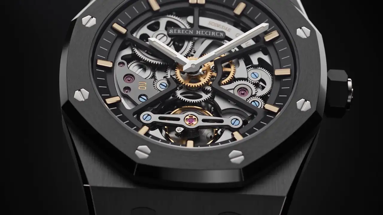
A dark colour, gold lettering and a full-screen photograph can suggest a premium world. They do not, however, establish an identity. When the same formula is applied to a hotel, a jeweller and a consultancy, their websites begin to resemble one another even though the businesses should be distinct.
The visual language of luxury becomes more useful when treated as a set of compositional principles: selection, precision, proportion and continuity. Web design interprets these principles through your actual offer. It must then establish whether that interpretation helps visitors understand, observe and act.
Selection gives important things room to be seen
A display does not necessarily improve when it contains the entire stock. The same question applies to a website: what should someone encounter first to understand what makes your business particular?
Choosing an opening photograph is an editorial decision. A dramatic view may attract attention while revealing little about your work. A quieter detail may immediately demonstrate a quality that characterises it.
Consider a fictional furniture workshop specialising in carefully constructed joints. A fully styled interior photograph shows the finished result, but the furniture may disappear within the decoration. A close-up of its construction, paired with a precise headline, introduces the subject more directly. The atmospheric interior can follow when visitors want to imagine the piece in use.
Selection does not mean removing useful information. It means arranging it. An initial view can be simple, provided specifications, details and explanations are easy to find afterwards.
Assign each piece of media a function: introduce the setting, explain a material, show an application or identify a person. Where several photographs perform the same task, examine what each contributes before retaining them all.
Proportion creates emphasis without shouting
The size of a heading, the width of an image and the gap between two blocks communicate importance. These proportions can establish presence without adding decoration.
A large headline works best when it remains short enough to be understood as a whole. If it requires several crowded lines on a phone, its scale can become an obstacle. A clearer formulation or a different size on smaller screens may be more appropriate.
Text width deserves separate consideration from image width. A photograph may occupy a generous area, while its explanation benefits from a comfortable column. Sharing an overall alignment does not mean forcing every type of content into the same dimensions.
Spacing should also communicate relationships. A heading and its paragraph need to look connected; two different subjects should appear separate. When every gap is identical, part of the hierarchy disappears.
When reviewing a page, concentrate briefly on its major shapes: headings, images, paragraphs and empty areas. If everything seems equally important, strengthen the compositional differences before introducing another colour.
Materials should reveal something real
Stone, paper, metal, wood and fabric can inform a brand’s visual world. Bringing them onto a screen requires a choice between showing an actual material and using a decorative imitation.
A photograph of a material used in your work can convey information. A marble-like background unrelated to the business merely borrows a symbol. The distinction lies in its connection with what you actually offer.
A material can appear through a photographic detail, a colour palette taken from a project, a restrained pattern or a transition from an overall view to a close-up. Every section does not need a textured background.
Take particular care with surfaces carrying text. A beautiful piece of veined stone or strongly patterned fabric may be difficult to read over. Keep the most expressive details in visual areas and use calmer backgrounds for explanations.
For a craft brand, grain and irregularity may be meaningful. Removing them systematically to produce a smooth image can remove part of the subject. Good photography should make the material understandable, rather than turn it into a generic surface.
Typography expresses a voice, not an automatic category
A serif typeface can suggest an editorial character; a sans-serif design may feel more direct. Neither choice automatically classifies a website as premium or ordinary.
Examine the letters in the words you will actually use: company name, service titles, project names and planned languages. A typeface that looks attractive in a short demonstration may be less suitable for extended content or particular characters.
Build a limited, stable hierarchy. Main headings, subheadings, paragraphs and captions have different functions, but do not necessarily need different type families. Too many variations can make the brand’s voice uncertain.
Spaced capitals may suit short labels. Applied to all copy, they become a constraint. Extremely fine lettering can also lose its presence depending on the background and display size.
Ask to see a text-rich service page, not only the homepage. This is where you can judge whether typographic character supports reading or makes it harder. Use real paragraphs rather than repeated sample text so that the review reflects the final experience.
Colour is a relationship, rather than a borrowed symbol
Gold cannot replace a brand identity. White does not require neutrality. Saturated colour does not prevent sophistication. The result depends on proportion, combinations and use.
Distinguish the roles of the main background, alternative background, text, signposts and actions. An expressive colour can be reserved for a few elements to retain its significance. When it appears everywhere, it ceases to indicate much.
Test the palette with actual photographs. Pale stone, warm portraits and night-time images will not respond to the same background in identical ways.
Alternating light and dark sections can create rhythm, but each change should support a purpose: moving from story to explanation, setting apart a team presentation or giving an image its own space. A purely mechanical alternation may fragment the subject unnecessarily.
Finally, examine practical states: links, hovered buttons, active fields and error messages. The palette should support these situations without requiring a new identity for every interaction.
Rhythm should provide breathing room without causing delay
A page might move from a visual opening to a short explanation, a detailed project and an invitation to continue. Content establishes this rhythm first; animation may then underline it.
A photograph, a caption and a multi-stage method ask for different kinds of attention. Avoid automatically giving them the same section height or entrance effect.
A slow transition may look elegant during a demonstration, then become inconvenient when someone needs information they already know exists. Some visitors want to discover; others want to retrieve.
Scroll sequences are appropriate when progression matters: assembly, a changing viewpoint or the development of a space. They need a story clear enough to justify the time spent exploring. Decorative movement stretched over a long scroll can feel empty even when its imagery is attractive.
Consider returning as well as progressing. People should be able to revisit a detail, move back to information or open another page without losing their bearings. Rhythm is an invitation, not an obligation to attend a performance.
Interpret the principles through your own sector
The same principles can lead to very different identities. These examples are possible directions, rather than recipes to apply automatically.
| Business | Editorial material to emphasise | Possible visual expression | Risk to avoid |
|---|---|---|---|
| Architecture | Space, constraints and use | Overall views supported by plans and details | A gallery without project explanation |
| Hospitality | Atmosphere and welcome | Light, scenes of a stay and precise information | Attractive images without practical guidance |
| Jewellery | Shape, finishes and making | Close-ups and controlled composition | Decoration that obscures the piece |
| Consulting | Reasoning and support | Clear typography, diagrams and portraits | Prestige symbols without evidence of expertise |
| Craft | Working gestures and materials | Documentary images and construction details | Images too smooth to explain the work |
In each case, art direction benefits from an identifiable subject. A website becomes recognisable because it shows your way of working, rather than because it repeats scenery commonly associated with prestige.
It can be useful to write a short explanation beside a visual reference: what the reference helps communicate, what should not be copied and which real content will replace the example. This keeps discussions focused when several people have different aesthetic preferences.
Check that the visual language serves the experience
Before adopting a proposal, explore it through ordinary tasks. Can you read an explanation without magnifying the screen? Understand the menu? Identify a service that addresses a need? Return to a project already viewed?
Then consider what the presentation implicitly promises. A highly demonstrative style may suggest a different kind of business from yours. If your strength is a close working relationship and precise support, an impersonal identity may hide that quality.
Also assess its ability to last. A compositional rule should accommodate a new project, a photograph that is less panoramic or a longer heading. If every change breaks the balance, the proposal probably needs a more resilient system.
Ask who will apply those rules after launch. A sophisticated design that depends on undocumented decisions is difficult to maintain. Image guidance and a few representative page examples make the visual language usable by the people responsible for future updates.
Interpretation matters more than collecting prestige signals
Luxury design principles become useful when they make your offer easier to understand, your photographs more meaningful and your identity more consistent. Their role is to support a presence that fits the business.
To discuss your next website with MV Design, gather representative content and identify the qualities you want people to perceive. Proportion, materials and rhythm can then be explored through the reality of your work, rather than through an interchangeable visual formula.