What distinguishes a luxury website from a conventional website?
A premium website is defined by more than a dark background or a striking animation. Its quality comes from the relationship between your brand, the evidence of your expertise and the ease of the visitor’s journey. These practical criteria help distinguish a worthwhile investment from a decorative change.
A business can deliver an outstanding service while its website does little to demonstrate that quality. Interchangeable photographs, vague descriptions and uncertain navigation make the offer harder to understand. An impressive interface can also miss the point if visitors leave without knowing what the company actually does.
A luxury website is therefore distinguished less by a catalogue of visual effects than by the quality of its decisions. It expresses a specific identity, presents convincing evidence and guides visitors with care. For a business owner, the useful question is where that attention creates something customers can recognise, and how to translate it into concrete design choices.
Coherence matters more than a decorative style
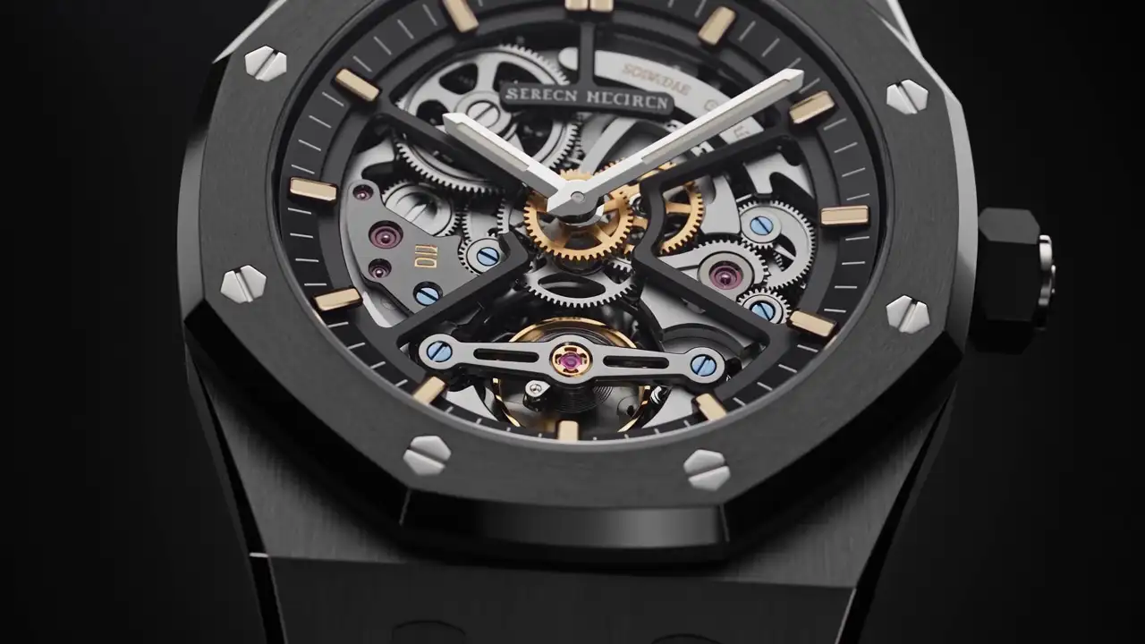
Black backgrounds, gold accents, large photographs and delicate lettering do not define premium design. They may suit a watchmaker yet feel artificial for an architectural practice whose work is grounded in natural light, untreated materials and restraint.
Start with your positioning: what you offer, whom you serve and what explains your way of working. The website should make those points understandable, including to someone who discovers the company without an introduction or personal recommendation.
Coherence does not mean making every page identical. A completed project may benefit from a generous visual presentation, while the contact page calls for greater simplicity. The connection comes through the hierarchy of information, the quality of the photography, the tone of the writing and the way the interface responds.
To assess a proposed design, temporarily cover the logo. Could the images, words and layout belong equally well to several competitors? If so, the work of establishing a recognisable identity probably needs to go further. A different colour palette alone is unlikely to resolve the underlying issue.
Evidence gives meaning to quality claims
Words such as “excellence”, “exceptional” and “unique service” do not explain an offer. A visitor needs to understand what they might actually see, receive or experience. This precision is particularly valuable when a meaningful price can only be provided after a conversation.
For a craft business, a photograph of a working gesture accompanied by an explanation of a material choice can reveal the value of the process. For a hotel, information about rooms, included services and arrival arrangements helps prospective guests imagine their stay. For a consultancy, its method and the responsibilities of named contacts can offer more substance than an abstract image.
Consider a fictional illustration: two companies build bespoke villas. One presents a gallery of finished properties. The other connects each project to the initial brief, the constraints of the plot, the decisions taken and selected views of the result. Without claiming any invented performance, the second approach makes the thinking and support easier to appreciate.
Selection is as important as quantity. A few well-documented projects may explain the business more effectively than a large catalogue with inconsistent images and missing information. Where work is confidential, describe what you can legitimately disclose instead of inventing an alternative reference.
Art direction should grow from real content
Art direction brings together the visual choices that give a website its character: photography, colour, typography, composition and movement. Its purpose is to serve the subject, rather than forcing the subject into a borrowed style.
The available material directly influences the outcome. A dramatic mock-up built around demonstration images may become less persuasive when populated with your own photographs. Assess at least one representative page early, using realistic media and copy that is close to its final form.
Typography also has a practical role. A distinctive headline style can add personality, but service descriptions still need to be comfortable to read. An attractive typeface cannot compensate for text that is too small or difficult to distinguish from its background. Establish clear roles for headlines, body text, captions, navigation and practical information.
Visual effects are worthwhile when they reveal something. A transition can connect two stages of a project; an animation can explain how a product is assembled. Movement attached to every element, however, can compete with the offer itself. Ask what the effect helps someone understand that a straightforward photograph or sentence would not.
This question does not rule out expressive design. It gives expression a purpose. A striking opening sequence may be appropriate for a highly visual collection, provided visitors can also reach useful information without repeating the entire introduction.
Navigation should respect the visitor’s time
A premium experience should not require special training to locate ordinary information. Menus need to be understandable, services identifiable and contact options accessible.
A prospective client may arrive directly on a service page without visiting the homepage. Each important page should therefore provide enough context to stand on its own: whom the offer serves, what need it addresses, how the work unfolds and what the visitor can do next.
Navigation can have a strong personality while retaining explicit labels. “Services” or “Projects” may be more helpful than conceptual language that leaves people guessing. Creativity can shape the presentation without making the signposts ambiguous.
On mobile, care becomes apparent through simple actions: opening and closing the menu, browsing a gallery, reading a caption or entering a message. Check these tasks with real content. An attractive composition on a large monitor does not establish the quality of the complete experience.
Restraint also applies to invitations. A relevant invitation to discuss a project, placed after a useful explanation, may be enough. Repeated pop-ups, competing buttons and constant interruptions give visitors an additional job: finding the information they originally came to read.
Compare decisions, rather than production labels
A website based on an existing template can be carefully made and appropriate. A fully bespoke website can still be confusing. The production method does not guarantee the outcome.
| Point to examine | Mainly standardised response | Response closely adapted to your brand |
|---|---|---|
| Page structure | Content is fitted into existing blocks | Blocks reflect your information and its relative importance |
| Photography | Images fill spaces in the layout | Selection and framing develop around your actual subject |
| Service presentation | General descriptions of activities | Needs, method, scope and examples are clearly connected |
| Navigation | The same generic journey for everyone | Access reflects the main reasons people visit |
| Future changes | New content follows the limits of the template | Rules preserve coherence as new pages are added |
These differences do not automatically justify a complicated solution. If your business has a straightforward offer and a limited amount of content, an existing foundation adapted with care can make sense. Bespoke work becomes more relevant when your project presentations, editorial needs or particular journeys require a specific response.
Ask an agency to demonstrate what each proposed choice will enable. “Personalised” should translate into visible decisions: a distinctive project page, a better-organised explanation or content management that fits the people who will use it.
The same approach helps when comparing proposals. A longer list of effects is not necessarily a more useful scope. Look for a clear relationship between the work proposed and the problems your business needs to solve.
Practical details complete the experience
A form error, an awkwardly cropped image or an inconsistent label can seem minor when you examine a page in isolation. During a visit, those details form part of the relationship with the company. They can interrupt an action or leave an important question unanswered.
Give the contact form particular attention. Explain what information is needed, restrict the fields to what serves a purpose and make the next step clear after submission. Do not promise a response time that your organisation cannot reliably support.
Apply the same care to editorial maintenance. An outdated service, an inaccurate team page or contradictory contact details create a gap between the visual presentation and the operational reality. Keeping content current belongs to the same quality standard as the initial design.
Also consider conditions that are less flattering than an ideal demonstration: an average connection, a small screen, a very long project title, a portrait photograph or a detailed service description. A considered interface remains understandable in these circumstances. It should not depend entirely on perfectly proportioned sample content.
These checks are most useful before launch, while changes can still be made coherently. Agree who will review them and which pages represent the different types of content used throughout the site.
Decide where to invest first
Begin by identifying the largest gap between the quality of your actual work and what the website allows people to perceive. If evidence is missing, a new colour palette will not supply it. If visitors understand your expertise but cannot find the right contact, the enquiry journey deserves attention.
A first assessment can be organised around five questions:
- Could a visitor explain your business after exploring the homepage?
- Do service pages answer the questions that commonly precede a meeting?
- Do the images show your real work with reasonably consistent quality?
- Are important pages comfortable to use on a phone?
- Is someone responsible for keeping the content current after launch?
Then distinguish necessary work, desirable improvements and experiments. This order helps prevent a substantial part of the project from being absorbed by an effect while the content and visitor journeys remain incomplete.
Assess proposals using representative pages: homepage, service, project and contact. Ask how those pages will evolve, too. A lasting result requires future publications to maintain the original level of care without repeatedly rebuilding the design.
Make the standard useful to your business
The defining difference of a premium website is the attention it gives both to the brand and to the people discovering it. Visual identity, content, navigation and practical details should communicate a consistent impression: a company that understands its offer and makes a relationship easier to begin.
Before commissioning a redesign, gather examples of your work, recurring prospect questions and the pages that no longer represent you well. Discussing that material with MV Design can help establish the most relevant design decisions for your next website.