Boutique hotels: how can your website extend the way you welcome guests?
A boutique hotel is distinguished by its welcome as well as its interiors. Your website can make that care tangible before arrival through truthful images, understandable room choices and accessible practical information. Discover how to create continuity with the stay without turning browsing into a compulsory tour of the property.
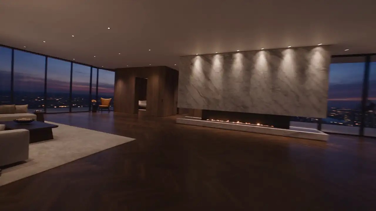
A boutique hotel may remain memorable because of its light, pace, conversation or a quiet act of care. Yet its website can sometimes resemble little more than a room list and booking button. Visitors then miss both the character of the place and the way they would be welcomed.
Extending hospitality online means connecting that identity with the practical questions surrounding a stay. The website should create interest, explain room differences and make the next steps easy. It does not need to reproduce a literal hotel tour: it prepares the relationship before arrival and supports the traveller’s decisions.
Define the care that characterises your hotel
Before discussing visual direction, ask what the team wants someone to feel at first contact. An urban house, a landscape-oriented address and a hotel designed for shorter stays may welcome people differently. Choose an intention that genuinely matches the experience the property provides.
Describe it through situations. How do travellers discover shared spaces? What is explained on arrival? Which details recur in conversations with guests? These observations provide more precise material than broad claims about refinement or friendliness that could be made by almost any establishment.
The website should also clarify whom the hotel suits through its actual characteristics. It can welcome several profiles without promising an identical experience to everyone. Describe uses and facilities so visitors can consider their fit with the stay they have in mind.
A short statement may set the welcome’s tone, but subsequent pages need to support it. If the hotel emphasises calm, browsing should not be dominated by constant prompts and motion. Consistency is created by the behaviour of the interface as much as its visual appearance.
Introduce the place without delaying useful information
The first screen should identify the hotel, its setting and the next step. Photography or film can create an impression while visitors retain direct access to rooms, dates and practical details. Essential information should not depend on finishing a visual sequence first.
An immersive opening is relevant when it improves understanding of the place. It should not impose a long journey on a returning guest checking a category or condition. Keep a visible menu and understandable shortcuts, particularly on phones where attention may be brief and task-focused.
Choose imagery that genuinely belongs to the hotel. Destination photography can support the story, but should not replace the property’s presentation or imply ownership of an outside location. Accurate imagery is part of the quality of the first welcome, rather than a separate technical concern.
An introduction can describe the stay’s character in a few concrete sentences. Avoid interchangeable writing that would suit any address. A detail about spatial organisation or the life of the house offers more useful information than a succession of superlatives about the experience.
Present rooms as understandable choices
Category names can express the hotel’s personality, but need information that supports comparison. Visitors should understand differences beyond the names and positions in a grid. A distinctive label does not automatically tell them which option is appropriate for their stay.
Use a common structure: checked characteristics, arrangement, representative images and access to date search. Where rooms within one category vary, explain what is shared and what may depend on allocation, in line with the actual offer rather than an idealised version of every room.
Photographs should show enough to imagine use: sleeping area, circulation, bathroom and relevant views. Decorative details can supplement this but do not replace an understanding of the room. Travellers should not be expected to choose accommodation solely from a cushion or bedside table.
In a fictional example, two categories could have similar decoration but different outdoor space. The page should reveal that distinction and explain relevant conditions. An identical presentation with only a different name forces the traveller to ask a question the website could already have answered.
Describe moments of the stay through real services
Breakfast, a lounge, garden or restaurant can be important moments when they actually belong to the offer. Present them with practical information about their operation. An attractive photograph should connect with something the visitor can genuinely discover or request during the stay.
Do not let an image imply that a service is included in every booking if it is not. Useful details should be available near the related material or through an obvious connection with the applicable offer and conditions, rather than hidden elsewhere in the journey.
People can bring warmth to the story. Show the real team and relevant responsibilities with appropriate permission. An authentic preparation or encounter may communicate hospitality better than a stock photograph unrelated to the hotel, however polished that image appears in the design.
Where testimonials are available and authorised, preserve their authenticity and context. Do not invent them to complete a page. The website can already communicate a great deal through precise descriptions of spaces and the care your team genuinely provides to guests.
Give practical information a visible place
Hours, arrival arrangements, access and relevant conditions are part of hospitality. Hiding them within a long footer can create unnecessary searching. Group essential answers and offer a contact when an individual situation needs further clarification from someone who knows the property.
For accessibility questions, describe verified features and ways to obtain detail. Do not replace missing information with a general assurance. Travellers need to assess what meets their requirements, with help from the team where necessary rather than relying on an ambiguous symbol or slogan.
Policies concerning children, pets, parking or particular services should reflect the hotel’s real arrangements. If a condition depends on a room or rate, make the distinction understandable. Have applicable wording reviewed by the appropriate responsible people before publishing it as definite information.
A practical guide can help, but needs an owner for updates. Old information about arrival or a service may contradict the rest of the journey. Check consistency across the site, booking confirmations and documents sent before the stay so guests receive one coherent account.
Preserve continuity at the booking stage
Moving into booking should not feel like abruptly leaving the hotel’s identity behind. Room names, information and visual reference points should remain coherent as far as the selected solution allows. The visitor needs to recognise that they are continuing the same enquiry about the same property.
Make clear what is selected and what becomes confirmed. Searching dates, sending a request and completing a booking produce different results. Buttons and messages should describe the action that genuinely occurs instead of using the same celebratory wording for all three stages.
Present prices and conditions clearly within the journey. A highlighted figure should not create an impression different from the offer at the next step. Check significant information throughout the path, including where more than one tool or system participates in the booking process.
Test the route back to the hotel website too. Travellers may want to reread a description before continuing. They should be able to do so without unnecessarily losing search context or being required to repeat an introductory sequence that they have already viewed.
Welcome visitors on phones and in the languages offered
A phone visit may be brief: find a room, check an address or contact the hotel. Text, controls and information should remain available in those situations. Considered design does not require tiny type or complicated gestures to reach the details the traveller needs.
Adapt imagery to the available frame instead of automatically shrinking the desktop version. The crop should preserve what makes the room or space understandable. Pages also need to remain usable when some media loads more slowly, rather than leaving visitors unable to continue their task.
For each language, cover the full journey: introduction, rooms, useful conditions, forms and messages. Adapt naturally while preserving the same facts. Translation should not add a service or change a characteristic simply to make the description more appealing in the target language.
Where possible, check that the transition to the booking tool respects the selected language. An unexpected switch may force travellers to reconstruct their search. Content should help them continue, rather than making language comprehension an additional challenge midway through the decision.
Evaluate the website as a first welcome
Ask someone unfamiliar with the hotel to prepare a fictional stay. Can they understand its character, choose a category, find essential information and identify the next step? Their questions will reveal gaps that your own knowledge of the property may otherwise hide during review.
Ask the team about incoming enquiries as well. Do particular questions recur even though the answers are on the website? Perhaps they are poorly placed or too vague. A targeted improvement may be more useful than another animation that leaves the information problem unresolved.
Test a search with no availability. The message should explain the situation and provide a suitable next step, such as changing dates or contacting the team where appropriate. The absence of a room should not produce a blank page that looks like an error.
The website should maintain care from first impression through contact. To work on that continuity with MV Design, gather room categories, photography and travellers’ recurring questions. They form a useful basis for a digital presence that prepares the real experience of your hotel.