How do you present an exceptional property on a real estate page?
A distinctive property deserves more than a gallery and impressive adjectives. Its page should explain the setting, arrangement and details that may matter to a prospective buyer. Discover how to build a precise narrative, choose useful photographs and connect the information with a properly prepared request for a viewing.
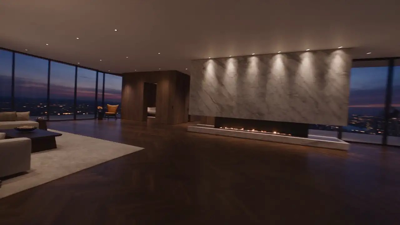
An exceptional property cannot always be understood through numbers alone. Two homes may share a floor area and room count while offering very different uses, atmospheres and constraints. A real estate page should make those distinctions understandable without replacing precise information with an attractive narrative.
A useful balance combines visual discovery, comparable facts and writing specific to the place. Visitors should be able to appreciate the property, understand what it genuinely offers and prepare their questions. That connection gives the presentation commercial value beyond its immediate visual effect.
Choose a central idea that belongs to the property
Before writing, ask what a visitor should remember about this home. The answer may concern its relationship with the landscape, arrangement around a garden, main entertaining space or independent accommodation. Select something documented rather than a phrase that could apply to every listing in your selection.
Use that idea to guide the opening text and photographs. If the garden relationship is central, show how rooms connect with it. If the interest lies in separate areas, explain their arrangement. A spectacular pool view does not necessarily communicate the house’s most important characteristic.
Do not confuse distinctiveness with exaggeration. Words such as “unique” and “unmatched” do not help readers verify what makes the property different. A concrete statement about use or arrangement is more informative, provided it reflects features that have actually been observed and confirmed.
The central idea need not summarise every benefit. It provides an entry point, while the rest of the page develops other relevant aspects. Leave sufficient room for information that could influence a decision, even when it is less photogenic than the opening view chosen for the page.
Make the opening immediately informative
The first screen can combine the property title, location at an appropriate level of detail, a representative photograph and essential facts. Visitors should identify the nature of the offer without waiting for a slideshow to finish. The presentation should not make basic orientation difficult to find.
A title may connect the place with a particular characteristic rather than accumulating generic terms. Keep it faithful to the property and distinct from similar listings. An internal reference can supplement the title for communication, but should not be the only way someone can recognise the home.
Choose the opening image for what it explains. A general view often locates the building within its grounds. An interior may be better when it expresses the principal interest more clearly. Check the phone crop, where automatic trimming could remove the feature that made the photograph meaningful.
Keep photographs, facts and contact access visible. Someone returning after an initial visit may want to reach a plan directly. The opening therefore needs to work both for first discovery and for checking a detail that has already attracted attention during an earlier reading.
Organise the gallery as a reading of the place
Prepare a sequence connecting spaces: setting, arrival, principal rooms, bedrooms, outdoors and details, according to the property. The order can vary, but should have a rationale. A gallery arranged only around the individual beauty of images may leave the home’s actual organisation difficult to understand.
Remove duplicates that reveal no useful difference. Several views of the same sofa do not compensate for a missing photograph locating the kitchen or garden access. Quantity is not an objective in itself. Every image should contribute information or a distinct viewpoint rather than prolong the same impression.
Captions can identify spaces and explain relationships. They are especially helpful when several suites or buildings appear within one gallery. Without them, readers may mistake two rooms for the same space or fail to understand that a photographed area belongs to a separate building.
Distinguish property photography from views of the surroundings. A beach, landscape or nearby activity may clarify context, but should be identified. Visitors should not assume that a pictured setting belongs to the grounds or is directly accessible from the property unless that relationship has been confirmed.
Connect plans with photography
A plan complements photographs by explaining arrangement. It may reveal a level, route or relationship between separate parts of the site. Use a readable version suitable for publication, with explanations clear enough for someone who is not accustomed to interpreting architectural documents.
Avoid a miniature document that cannot be examined on a phone. Provide appropriate viewing or a file to consult where useful. The page’s essential information should nevertheless remain accessible without requiring several downloads before the visitor can gain a basic understanding of the layout.
A photograph can be connected to its position on a simplified plan when the available information supports this. That relationship helps move from visual impression to spatial understanding. Keep it easy to read: too many markers, colours or controls can make the feature more confusing than the original drawing.
In a fictional example, a main house and independent pavilion could appear on a site plan and then in two clearly named image groups. Prospective buyers would understand the separation of uses and ask more specific questions than they could after an unexplained succession of bedrooms.
Write descriptions that add facts and context
Text should explain what photographs cannot communicate alone. Present arrangement, functions and important characteristics in concrete language. A sentence explaining how a terrace extends several rooms is more useful than another abstract claim about refinement that provides no additional understanding of the property.
Separate verified information from possibilities requiring study. A room shown as an office should not automatically become an extra bedroom in the description without an appropriate basis. Likewise, potential alterations should not be presented as established rights or confirmed feasibility simply because they seem visually plausible.
Describe equipment and features according to their actual state and inclusion in the offer. Do not let furnished photography imply what is included when that has not been confirmed. Material transaction details should be reviewed by the appropriate people before appearing as definite statements on the page.
Keep the tone welcoming without prescribing the future owner’s ideal lifestyle. Possible uses can be presented as illustrations, but readers should retain their own imagination. Precise information gives them more freedom than a strongly scripted commercial scenario telling them exactly how they ought to live.
Use details to support understanding
Material, joinery and lighting details can make quality tangible. Choose those that explain a real characteristic of the place. A close-up should connect with the whole; otherwise it becomes a decorative image that may look attractive but remains difficult to locate or interpret.
A short sequence can show a space and its finishes: general view, transition and material. This is useful when a discreet feature deserves attention that it would not receive in a wide photograph. The sequence helps the reader understand both where the detail belongs and why it matters.
Avoid retouching that changes the perception of significant features. Photography should help people discover the offered property, rather than create a different one. Review images against the actual presentation and condition of the home, especially when editing could alter expectations before an eventual visit.
Video or an interactive tour can supplement the page when it clarifies spatial relationships. It should not become the only place essential information appears. Retain a directly accessible gallery and summary for visitors who do not want to start additional media during their research.
Present practical facts without breaking the design
Group comparable characteristics in a readable layout. Use consistent labels and verify every value. A considered listing should not turn necessary information into tiny text or icons whose meaning remains uncertain. Beauty does not remove the need for straightforward information retrieval.
Be precise about the published location and the nature of surrounding-area descriptions. Verify travel times or distances and their context before mentioning them. Avoid absolute claims about quietness, lack of overlooking or access to a service unless adequate evidence supports the statement being made.
Required information and applicable notices need review for the property and its marketing context by competent agency representatives. Editorial work should provide a clear presentation for them to assess, rather than improvising legal conclusions or treating a generic template as sufficient for every listing.
If certain details cannot be published, explain how they can be obtained where appropriate. Do not fill an absence with an assumption. Contact with the agency may be precisely what is needed to establish the information necessary for the next stage of the search.
Prepare a viewing through a contextual enquiry
At the end of the listing, invite questions or a viewing discussion according to your process. Include the property reference in the request. Prospects should not have to copy details already present on the page simply so the agency can understand which home interests them.
A free-text field lets visitors identify points to clarify, such as layout, viewing arrangements or fit with their requirements. Avoid excessive form detail when an initial conversation is sufficient. Explain what follows submission and make sure the displayed message reflects what the team will actually do.
Check that the listing changes when circumstances change. A shared page may remain in circulation long after its initial publication. Status, facts and the proposed action need to stay consistent with the situation maintained by the agency, including when the original offer is no longer available.
To improve your next listing, read one property page without relying on your personal knowledge of the place. MV Design can help organise its images, information and enquiry journey so the presentation prepares an informed conversation that reflects the property being offered.